
 View Project


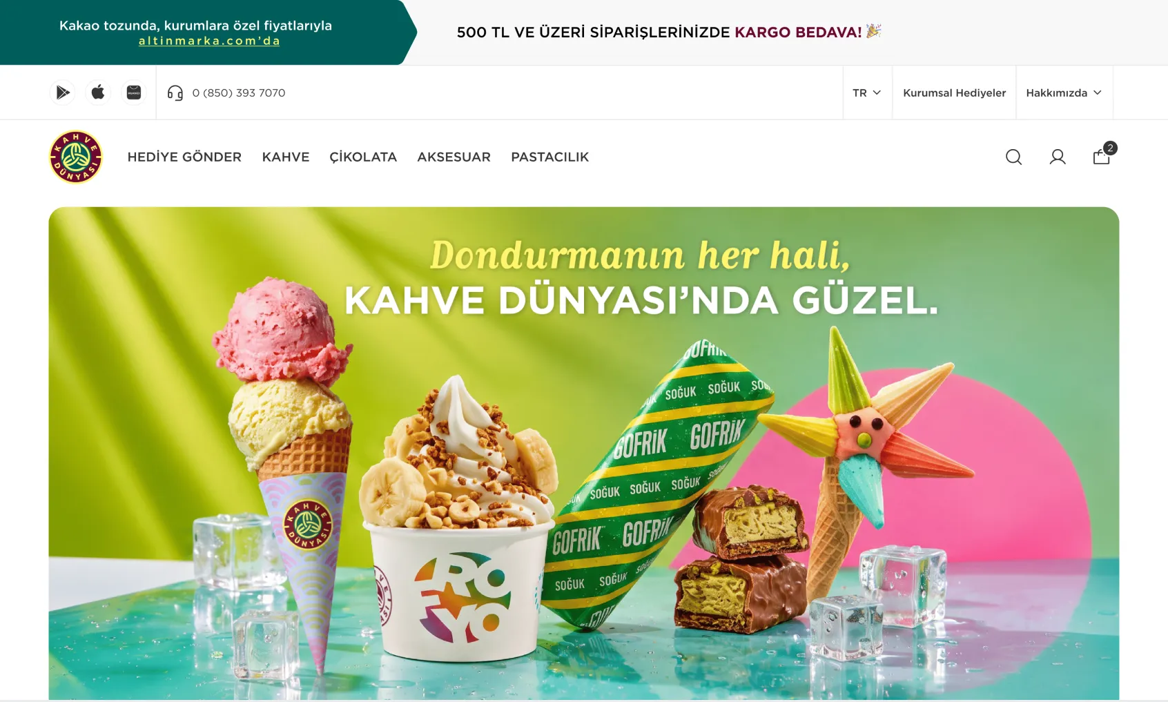
Kahve Dünyası Dondurma
A web experience designed to help users discover Kahve Dünyası's ice cream category and related products.
Enliq is a marketing automation and engagement platform that helps brands manage campaigns, track performance, and create personalized customer journeys. I worked on redesigning the dashboard and landing page experience, focusing on transforming complex workflows into a clean, intuitive, and easy-to-use interface. In this case study, I showcase the filtering experience improvements we implemented across the product, ESG Matrix, an AI-powered sustainability reporting product, and Loopi, an in-app story creation experience.
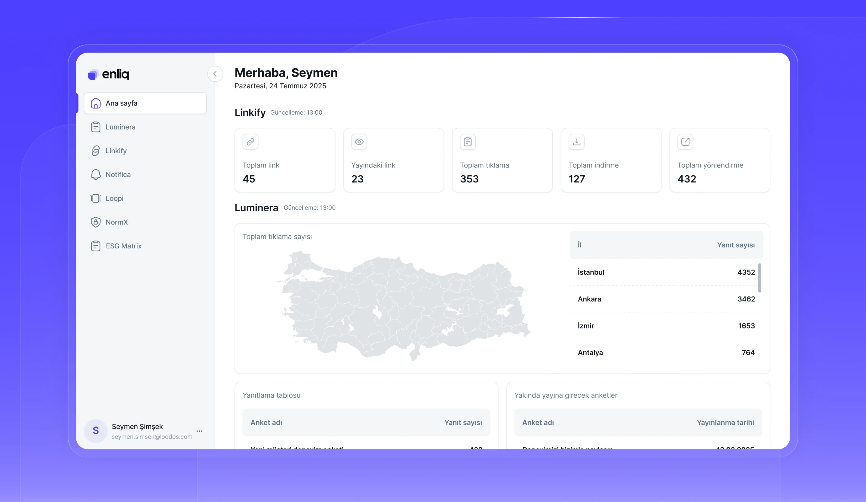
As Enliq grew, filtering patterns began to diverge across modules. The position, behavior, and scope of filters varied from module to module, which made decisions harder for the project team and created an inconsistent experience for users. Together with Hasan Aydın and Arda Arıcan from the Loodos design team, we revisited the filter experience; while we evaluated the design decisions together, I took on building the solution.
Some filters were applied instantly, while others required an extra “Filter” action.
Filter placement varied across screens, with no shared layout.
As the number of filters grew, the existing structure no longer fit on the screen and became harder to use.
With every new screen, how filters should be used was debated again.
Our goal was not to apply a single filter view to every screen, but to create a shared filter logic that could scale to different needs.
KPI cards were used to display information; they were separated from the filtering action and their clickable behavior was removed.
When the number of filters was limited, they were shown directly on the screen in a shared, consistent layout.
When the number of filters grew, options were grouped in a drawer to keep the main screen clean.
We adapted the improved filter logic to the needs of different screens. Depending on the number of filters, the usage context, and the screen structure, the same system can be applied in different ways.

Sustainability Reporting System
ESG Matrix is a product we developed to make Zorlu Holding’s sustainability reporting process more manageable. In this months-long process involving multiple employees, users can add information to the system throughout the year and create and store their responses based on the reporting standards and questions they select. Using everything they have accumulated, they can generate sustainability reports whenever they need.
The goal was to create not just a screen for answering ESG question sets, but an experience where users can build up their information over time, develop responses together with AI, and use this content in their sustainability reports.
Users define the report details, select the relevant reporting standards, and add their data to the system. They can then set the report’s scope by selecting questions linked to those standards.
Selected questions can be answered manually, or responses can be generated with AI using existing data. Generated responses can be refined with feedback and chosen from different alternatives.
Completed responses are brought together in an editable report draft. After reviewing the sections and making the necessary edits, users can generate the sustainability report.
For ESG Matrix, we developed different logo approaches that reflect the product’s systematic, technology-focused nature. We approached the sustainability theme through a more modern, product-focused visual language.






Loopi is an Enliq module that lets brands create and publish story-format content in their mobile apps. Users can set a story’s basic details, image, and publishing period, then add multiple snaps to the story and manage the content within a single structure.
The goal was to design an experience where brands could create and manage in-app story content through Enliq without needing a development team. Creating stories, setting the publishing period, and managing the snaps added to them were handled within the same flow.
Selected questions can be answered manually, or responses can be generated with AI using existing data. Generated responses can be refined with feedback and chosen from different alternatives.
Completed responses are brought together in an editable report draft. After reviewing the sections and making the necessary edits, users can generate the sustainability report.
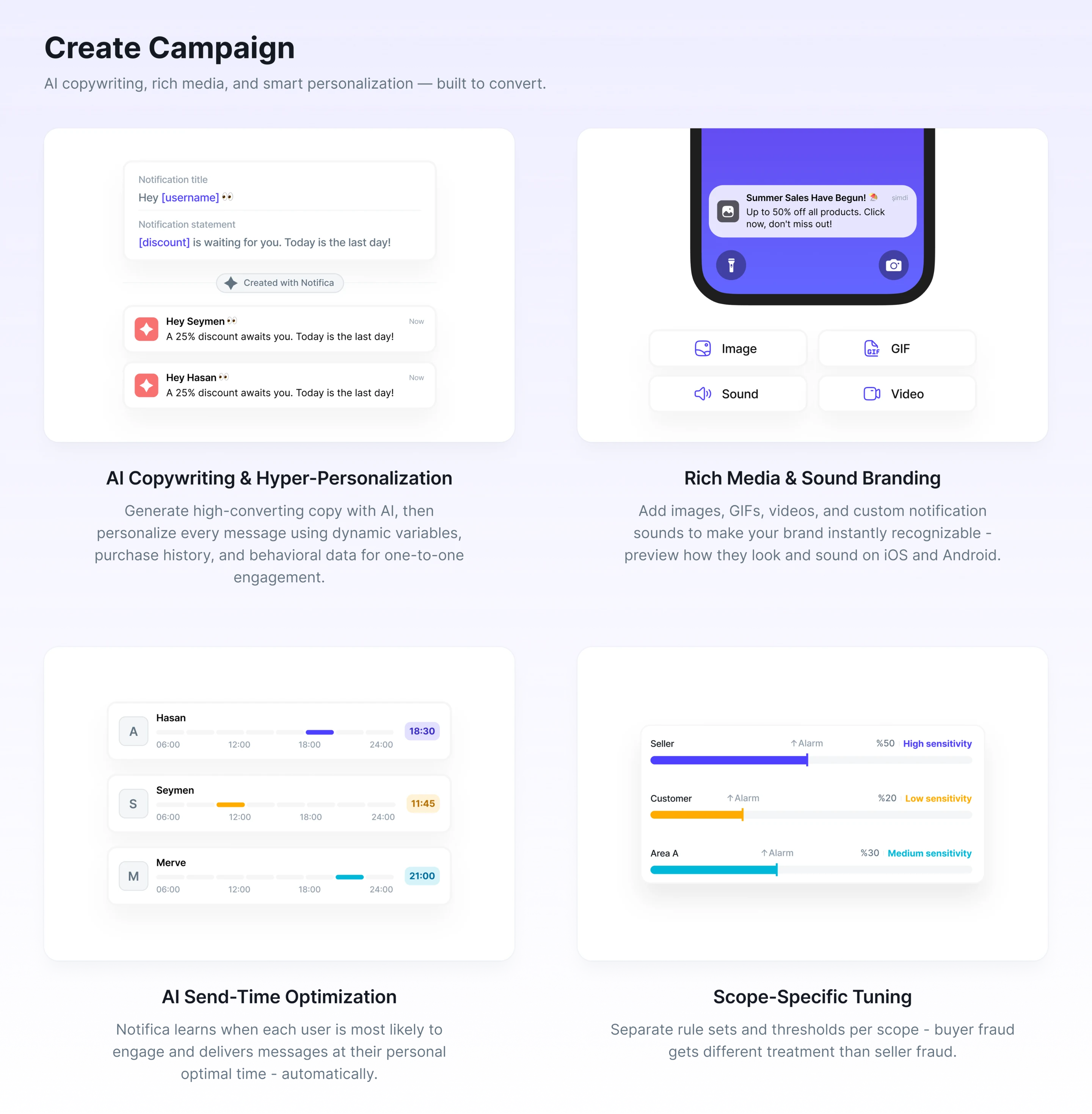
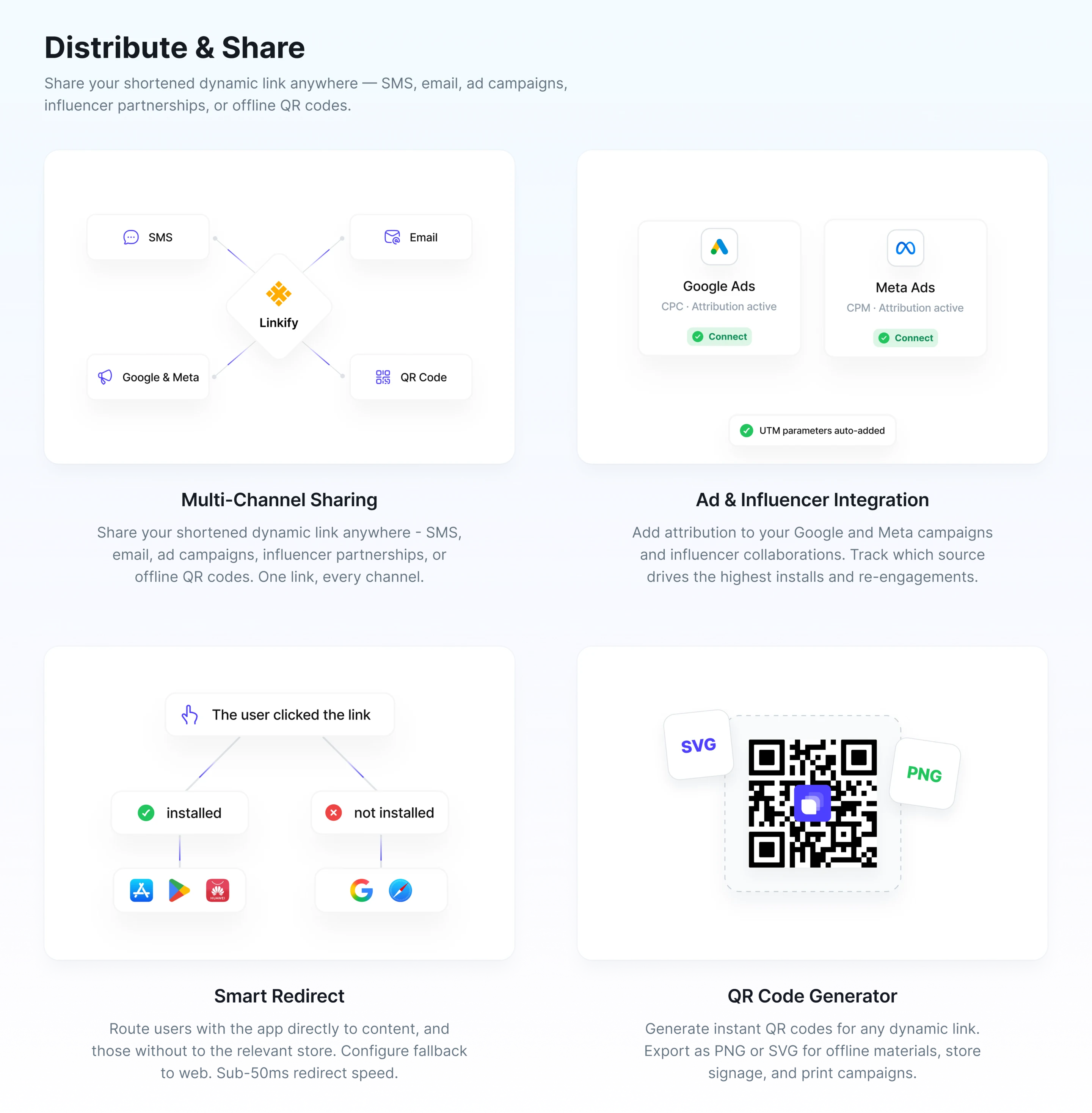
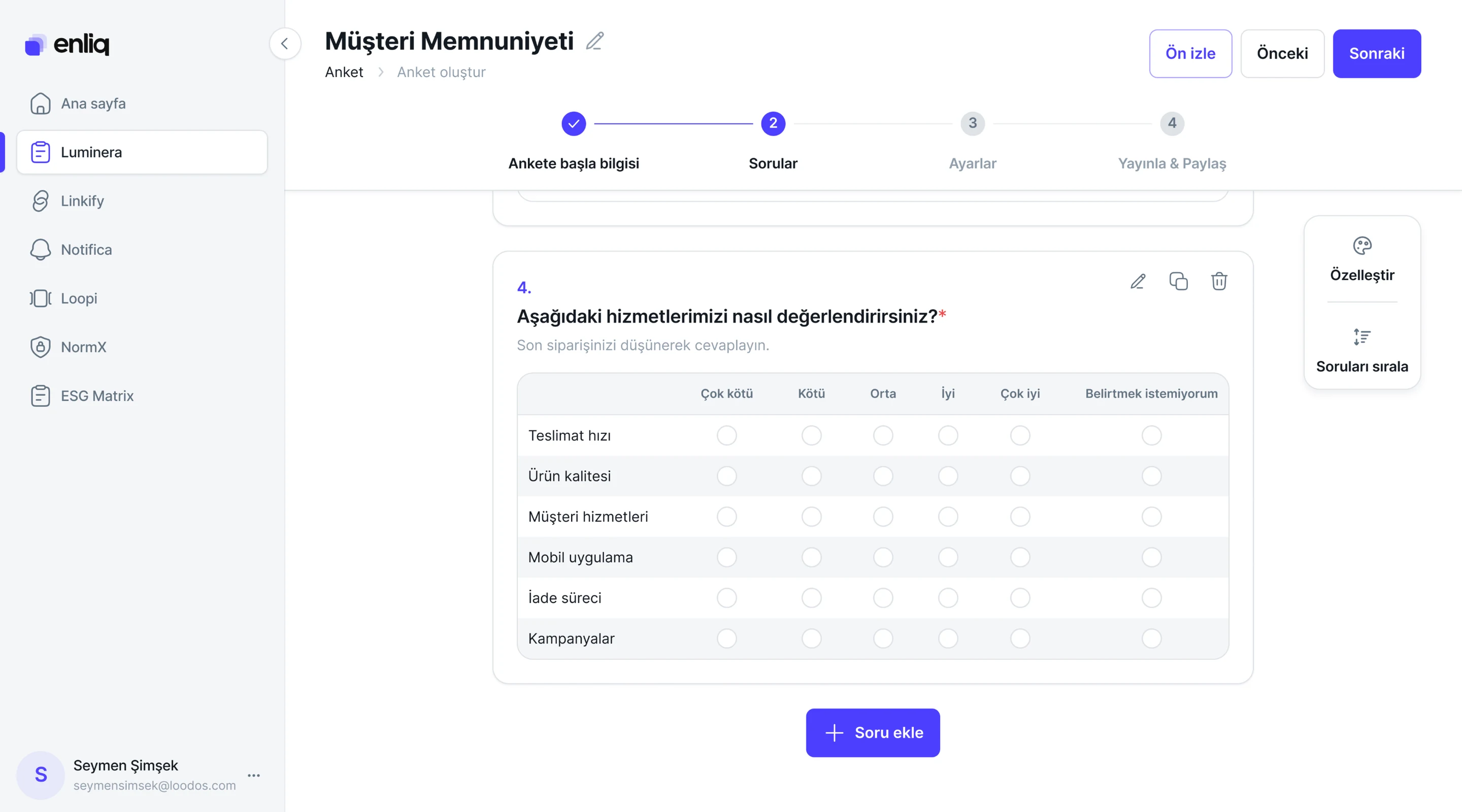
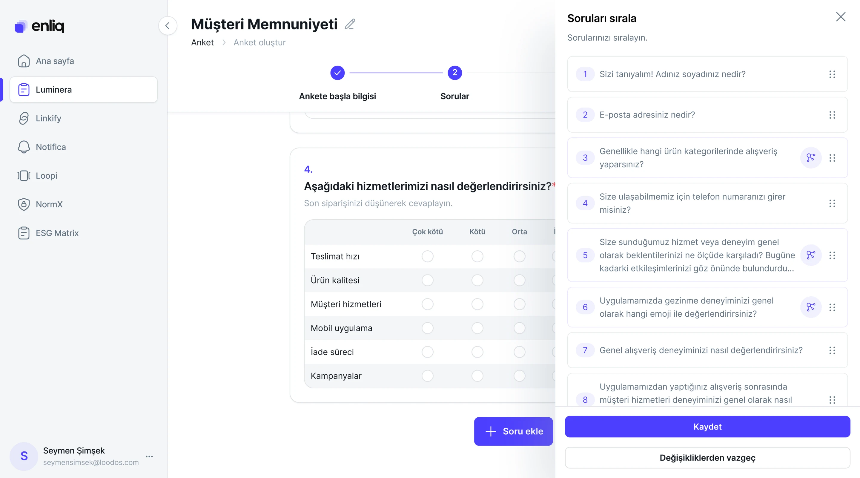
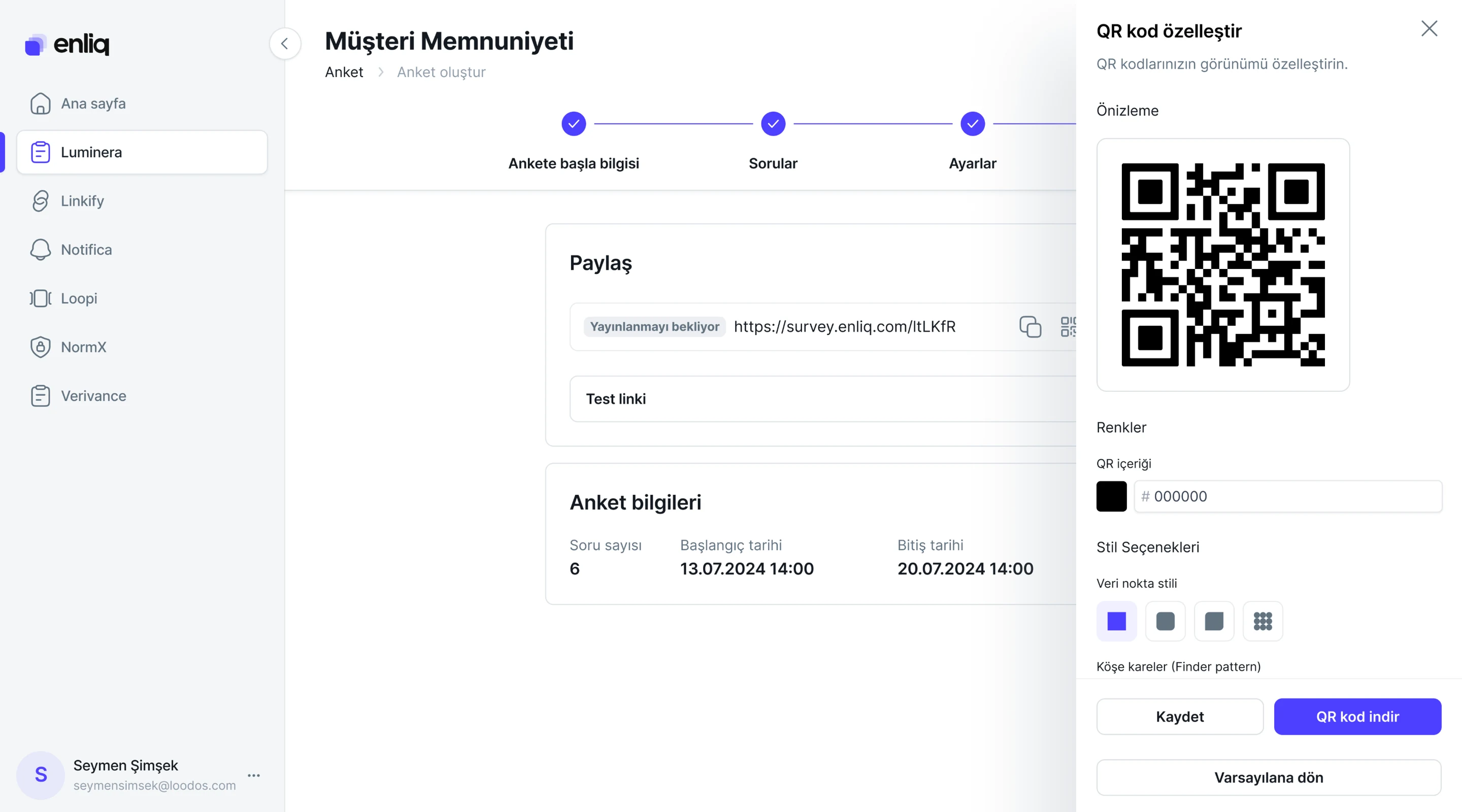
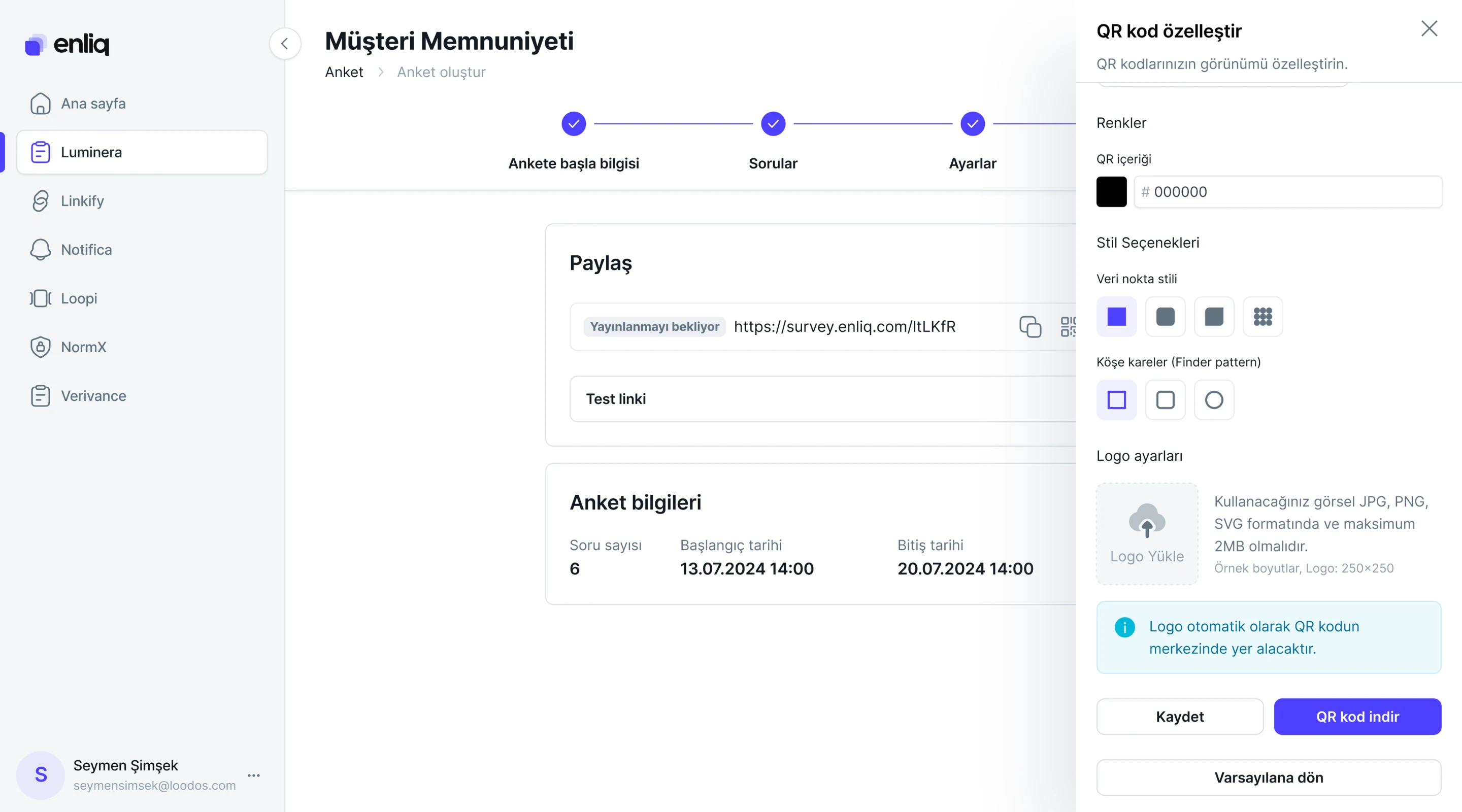
I also designed various screens and flows for other products within the Enliq ecosystem. Depending on each product's needs, I improved existing structures and contributed to making the interfaces simpler, clearer, and more consistent. Below are a few selected screens from these products.
A web experience designed to help users discover Kahve Dünyası's ice cream category and related products.
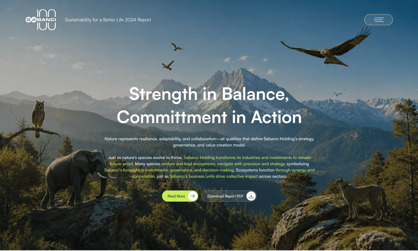
Sabancı’s 2024 Sustainability Report is a digital experience bringing together the company’s environmental, social, and sustainability work.
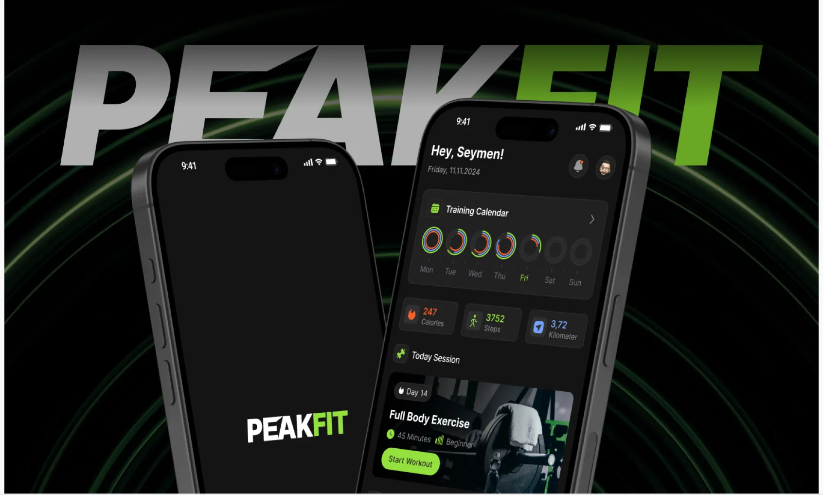
A mobile app that helps users reach their fitness goals through personalized workout plans and progress tracking.
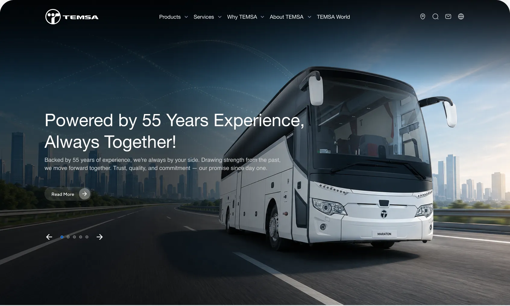
A corporate web experience that brings together TEMSA's vehicles, technologies, and mobility solutions.